Google Design’s Resizer
Test Your Sites Across Multiple Desktop And Mobile Screen Resolutions And Layouts
If you develop for the web, one challenge you always come across is how to make the best use of screen estate across so many different screens, layouts, and resolutions. It used to be that people only browsed from their computers which had a few limited screen resolutions possible. Now that number has risen, and with the advent of mobiles and tablets, the number of possibilities has gone up even more. Not to mention landscape and portrait orientations, which complicate things further.
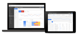
Viewing what a site looks like on different screens simultaneously can make things easier on developers and designers, especially when they want to check out many websites and get some ideas from what others are doing. Chrome Developer Tools’ Device Mode fills those shoes, but it only shows one resolution/layout at a time and it’s not easily accessible to the average user. Or at least it isn’t as easily accessible as this new Resizer tool.
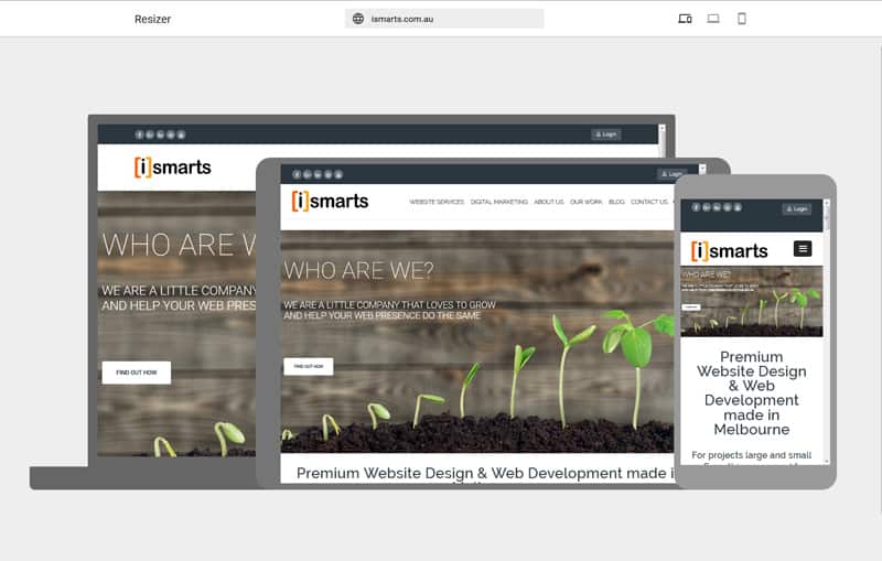
Resizer is a website at http://design.google.com/resizer/ that renders any web page URL you enter into three layouts: desktop, tablet, and mobile. All three are interactive so you can scroll and click, independently, in each one of them. You can also use the upper toolbar to switch to desktop view or mobile view exclusively. There, a small toolbar shows up with the different possible set-ups, from varying resolutions on desktops, to tablet and phone view with landscape or portrait orientation on mobile.

It’s all super responsive and fun to play with and could be a bit of a time saver if you just want to easily see how adaptive your or others’ sites are.
For help regarding getting your site Responsive please feel free to contact us.